When Eli and Alex co-founded Footprint they knew that to turn the category on its head, code alone wouldn't suffice – it was clear from day 1 that design was just as important. As a16z's Peter Levine put it, it's now the decade of design, "one where design, not just code, is at the center of product development and successful organizations".
Modern companies recognize that design, at its essence, is a driver of excellence. Among other things it produces better products, which end up leading to happier customers and healthier businesses. If there was a time when the value of design was perceived as too abstract, that's no longer the case. From a product perspective, obsessing over the tiniest details paves the way for a memorable user experience. From a customer perspective, merely solving a problem is not enough. It's ultimately about how you solve it, and to us that means delighting people and sparking joy. Finally, from a business perspective, exceptional design and superior financial performance are known to be strongly correlated.
That being said, how do we approach design at Footprint, and what does that mean both internally and externally?
First things first: I personally believe that design and engineering are intertwined. I won't go as far as saying that one doesn't exist without the other, but they most certainly elevate one another. And although we're a seed stage startup, we've been fortunate to have hired world-class people, engineers in particular, that deeply understand that a strong design and engineering culture, fostered by cross-functional collaboration, not only is a competitive advantage, but also a mindset – a way of working. It helps us move quickly and effectively while empowering people to make assertive decisions based on their day-to-day experience exchange.
Having a strong design and engineering collaboration culture, from the very beginning, allowed us to make crucial product and architectural decisions before designing a pixel or writing a single line of code. We wanted to ensure that whatever we set out to build would be completely scalable both from a design and engineering angle, and failing to do so could have a major impact on the product as the team grew. In other words, we were preemptively minimizing tech and design debt as much as we possibly could. No company is immune to this, and a lot of it comes from growing too quickly, but we were – and still are, of course – extremely mindful about how we build Footprint.
Setting the foundation
It's no secret that a design system allows you to move fast and ship a more consistent user experience. While I'm not here to deify it, taking the time to design and code a design system was vital to speed up product development and significantly reduce time to market.
Do we have a fancy design system or a dedicated team working on it? We don't. Do we have everything we need to save us hundreds of hours of back and forth between design and engineering? We do. Naturally, we're aware that things change, so the thought process behind it was that it should be flexible, but not too flexible. That keeps the team accountable for adhering to the system guidelines while giving design enough room to continuously evolve the product based on different learnings. Such learnings can come from customer feedback, engineering constraints and go-to-market strategy, for instance.
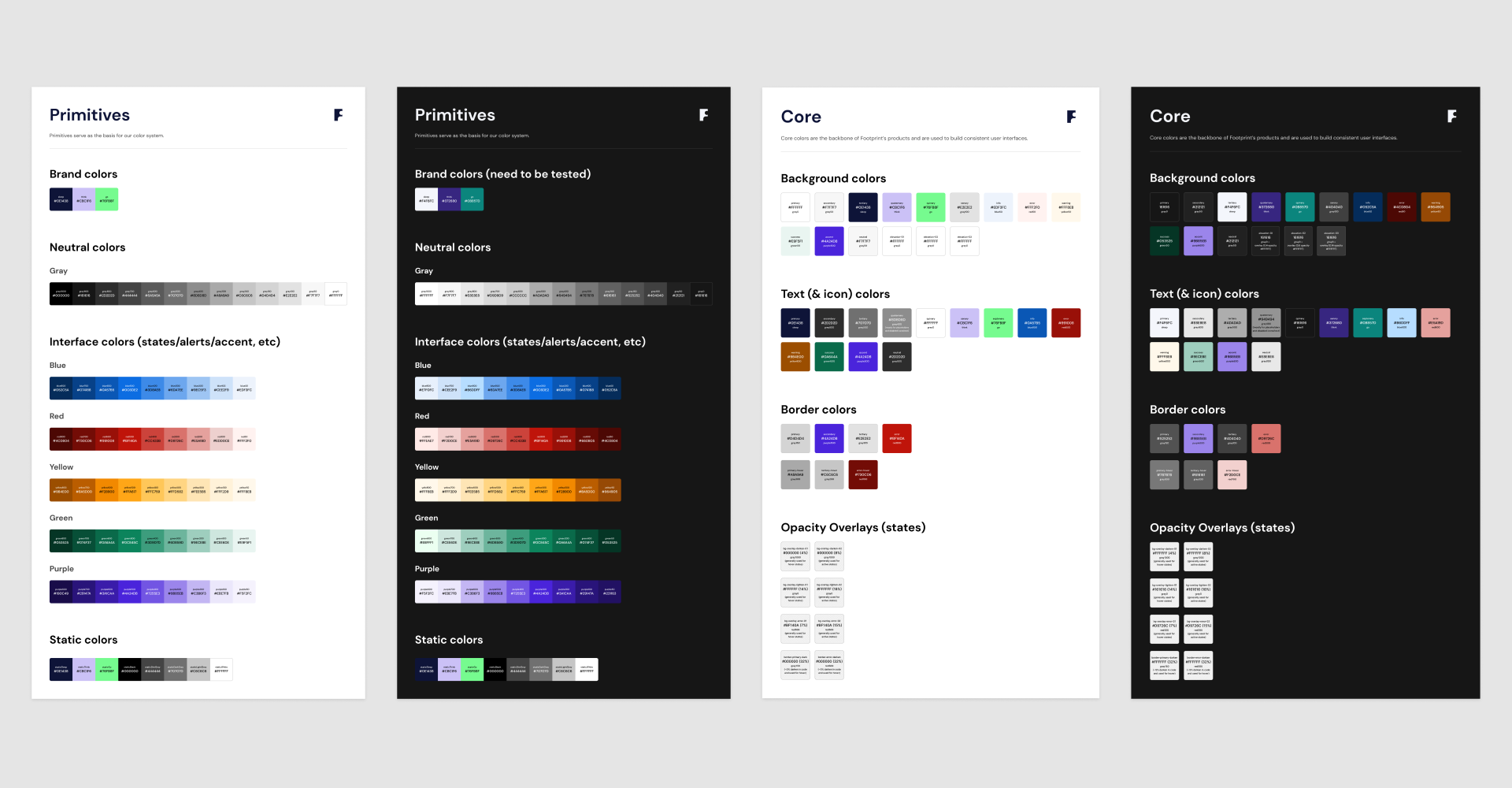
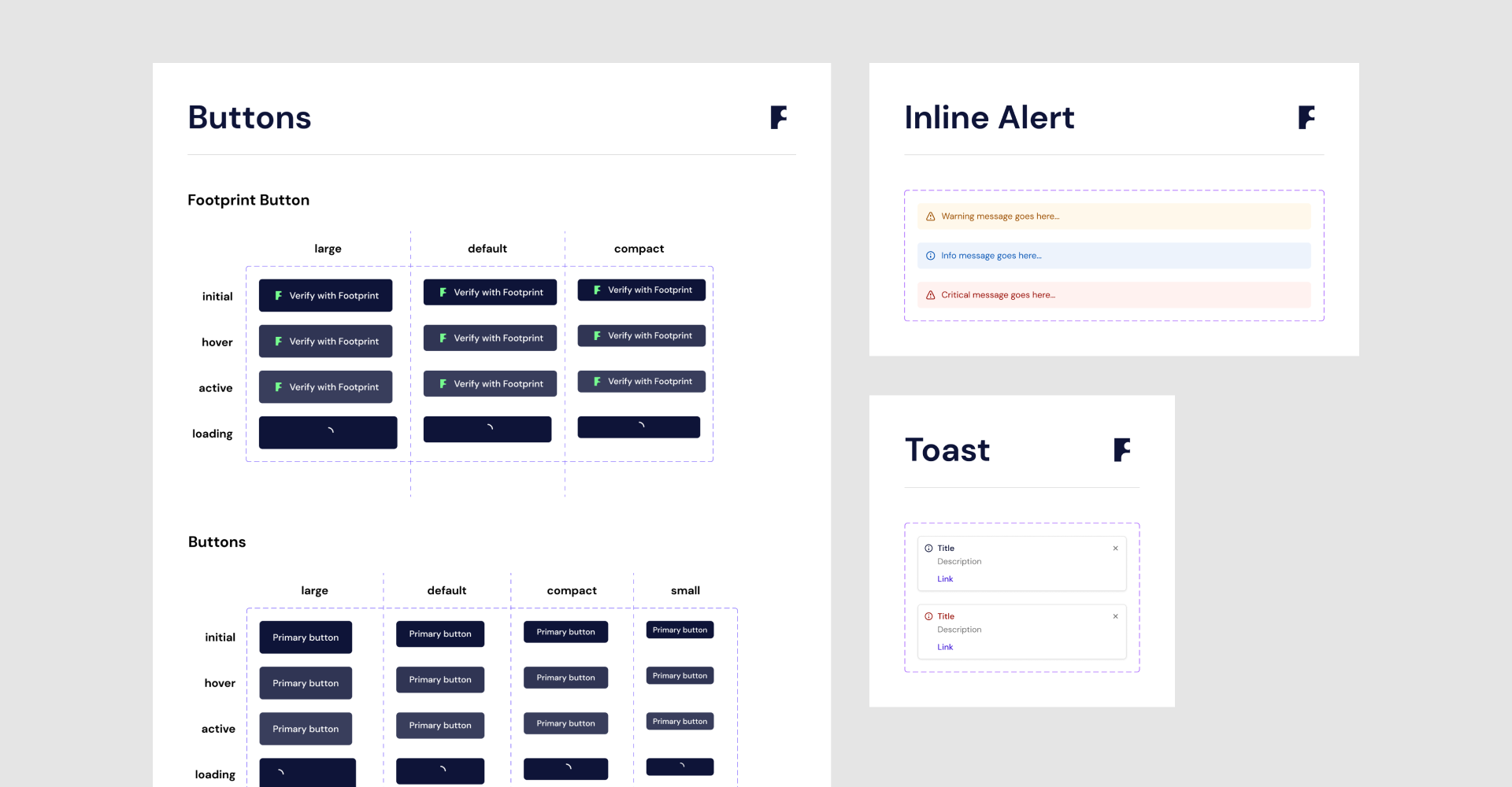
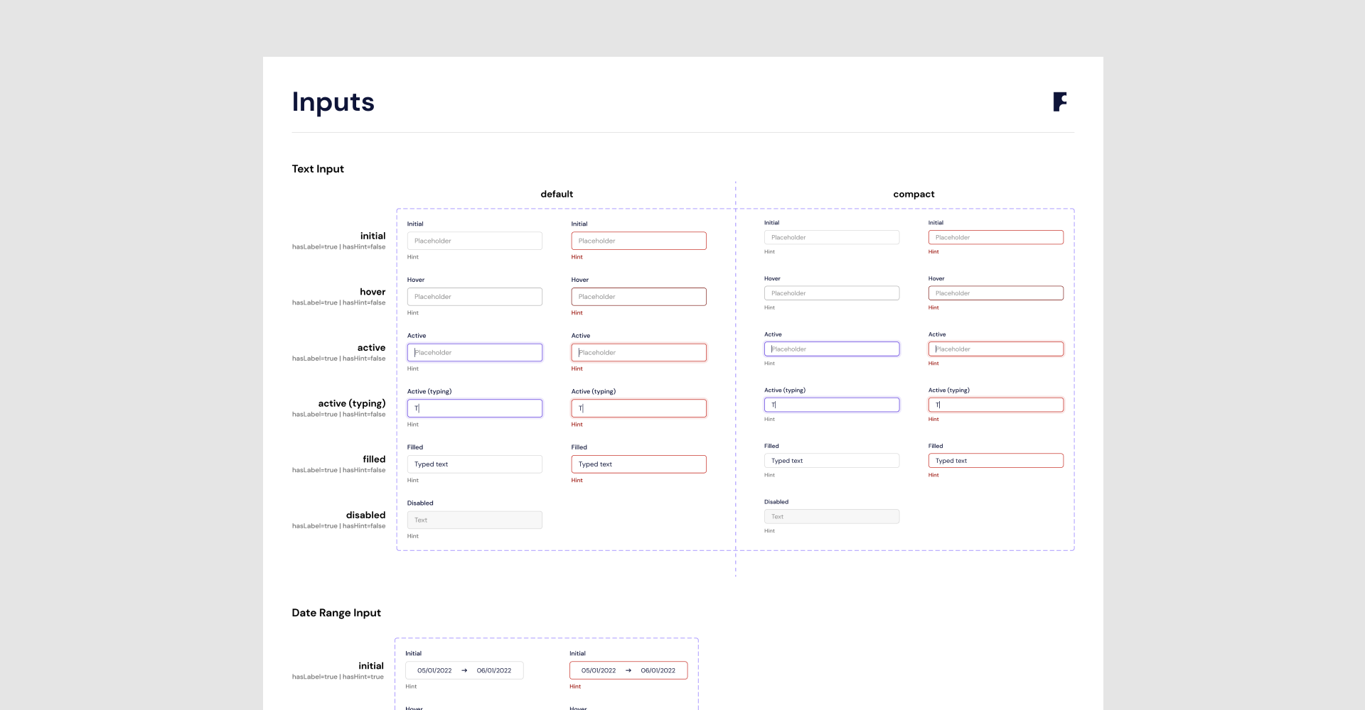
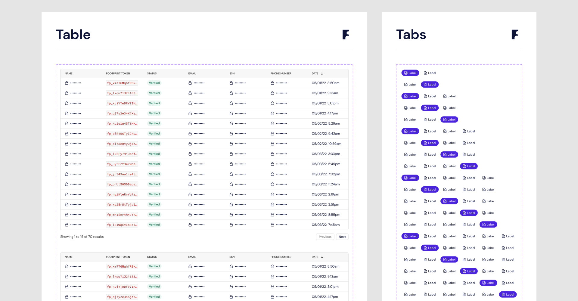
We've spent a full month defining and building out the barebones of our design system. Colors, type, spacing, border radius, elevation, icons. And, yes, we support dark mode as can be seen on the v1 of our Docs. We've also designed and coded components that we knew would be core to our product, regardless of how exactly it would work, or look like. To name a few, we've built buttons, input fields, selects, badge, modal, checkbox, radio button, table, date picker, toggle, toast, tooltip.
As we built our products, we kept iterating on the design system, challenging initial assumptions and adding more components to it. It's been ~6 months since we started building the entire Footprint frontend and we currently have 38 coded components in addition to the branding foundational elements. There's no design system police, but rather it's everyone's job to make sure it's used whenever possible. And it's ok to "go rogue" and try different solutions for different problems without strictly relying on what's available in the system, which is there to help the team move quickly and keep the user experience consistent and cohesive. It's definitely not there to limit creativity and craft.
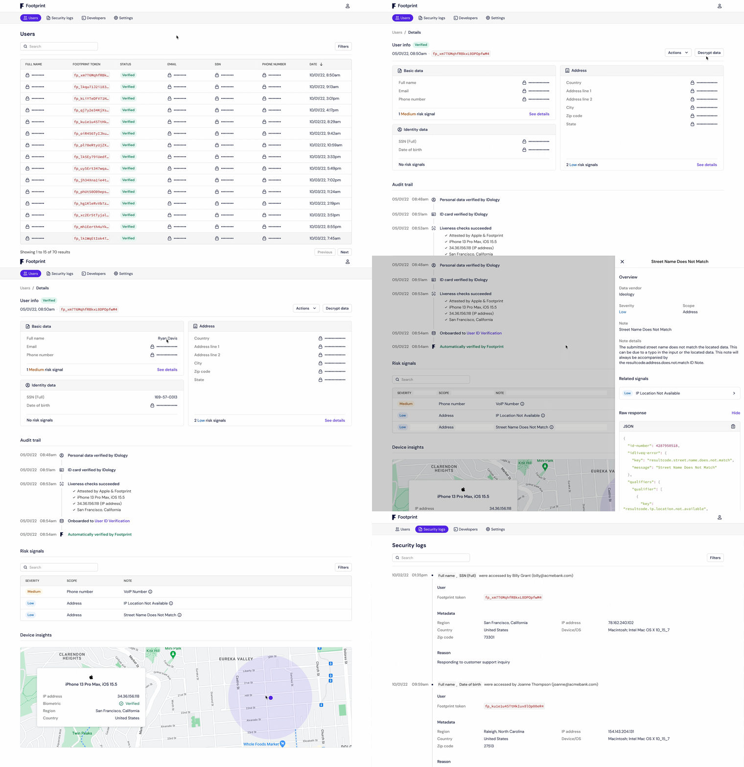
A strong design and engineering foundation also allows us to re-use components and patterns across multiple products. The same colors, fonts, icons and components that are used in our core product – an embeddable, one-click KYC solution – are also used in our Tenant Dashboard, Footprint Identity Wallet, Docs, Website and Blog, and can be extended to an infinite number of products, as needed. This not only noticeably increases our shipping cadence and quality, but also makes our suite of products more mature and consistent. Furthermore, as nothing in software is set in stone, a solid foundation makes iterating on our products 10X easier, freeing up designers and engineers to do less tactical, catch-up work and more strategic, innovative work.
Designing (and building) Footprint
Last month I tweeted about what it's like to work at an early stage startup and, particularly, at Footprint. Now I'll go a bit deeper into how we're building it.
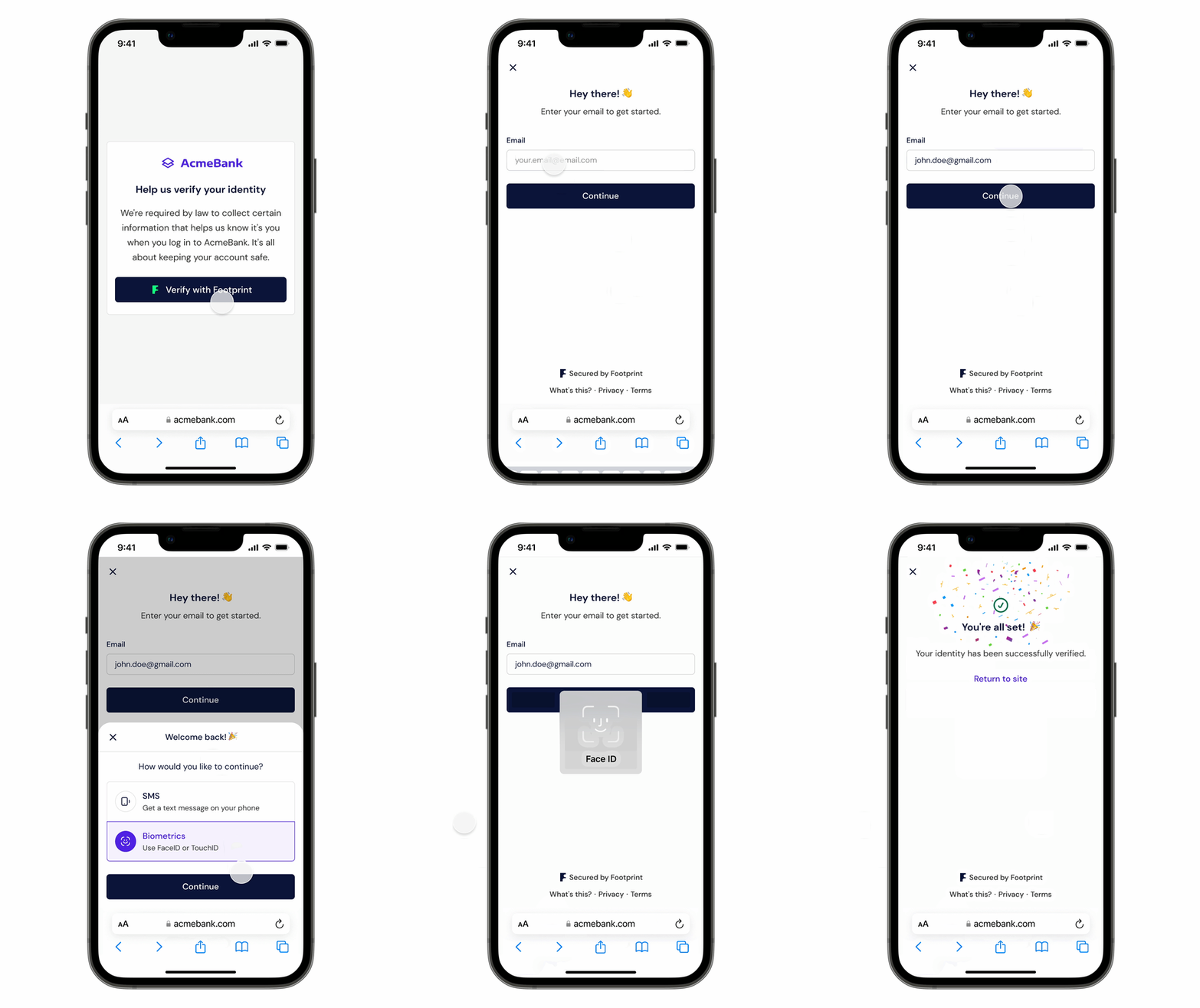
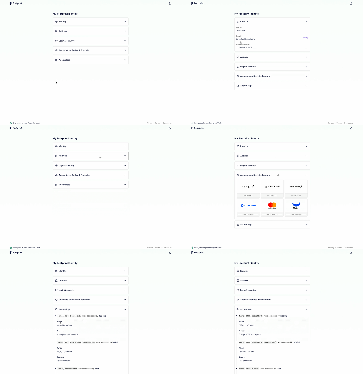
For additional context, Footprint's mission is to bring back trust to the internet. In short, we offer businesses a frictionless KYC solution and a secure, encrypted data vault. As Eli, our CEO, puts it, "we want to eradicate the toggle between friction and accuracy for enterprises when they onboard users, so they don’t need to choose between fraud and conversion". For consumers, Footprint is the last identity form they'll ever fill out. They do it once and can then verify their identity in one-click with the next company. Transparency-wise, whenever their data is accessed (decrypted) we log it and make it available to them, in their Footprint Identity Wallet, outlining why it was accessed and by which company. We're putting people in control of their data.
As depicted above, our mission and product are nothing short of ambitious. One could then argue that you'd need 20, 30, 50 people to even get started, but if there's one thing I've learned throughout the years is that having more people on the team doesn't necessarily mean better, or faster, outputs. As a matter of fact, when it's this early, and the team is inevitably small, things tend to move insanely fast – we're currently 9 people, and when I joined back in April we were 6.
The main implication of having a small team is that you need to fiercely prioritize and have a relatively clear and concise product roadmap. You can't really plan for the next 6-12 months. You plan for the next week, and the week after. The reason for that is that you're constantly faced with having to navigate ambiguity (which is why early stage isn't a fit for everyone). There are too many unknowns and assumptions simply need to be made. The goal then is less about executing against a detailed roadmap, but rather turning unknowns into knowns and minimizing personal biases while still shipping high quality, scalable software.
At the end of the day, I believe that if you know what the vision is, the how is initially less important. When we set out to build our KYC product, we didn't really know how it was going to work or look like from a frontend perspective, and probably everyone on the team had something different in mind. What was clear to everyone, however, was the vision. We wanted to build the last identity form people would ever fill out. Design would then serve as the bridge between the what and the how.
Truth be told, we don't have a fancy, structured design process at Footprint, and that's mainly because at first, as I mentioned, we'd be less concerned about the how and more about the what. Sure, the what may change as unknowns turn into knowns, but if your mission and vision are aligned, and the pain points are clear, the product you end up building is most likely a reflection of these. I'm not advocating for an overly simplified or non-existent design process, and every designer and design team will have a different one, but I believe designers should be more focused on tangible product and business outcomes and less on post-its on a wall.
Needless to say, successful products require a tremendous amount of work, passion, attention to detail and, why not, intuition. That's when the how comes into play and becomes exceptionally relevant. At Footprint we obsess over every pixel and interaction, so solving a problem just for the sake of solving it won't cut it. It's about the details, the craft, the experience, the joy. It's (almost) 2023, after all. People expect better, deserve better. We can't, and won't, compromise on quality, especially when we're dealing with such sensitive information, which are people's personal data.
At present, we're laser-focused on polishing all of our products' end-to-end experiences and expect to commercially launch soon (Q4 2022). Initial feedback from prospective customers has been great, which helps us validate some of our assumptions and shows that the market really is ripe for disruption. There isn't a single company out there that wants to build and manage vaulting, encryption, permissioning, IAM, audit logs, and more. Footprint solves all of that while offering a world-class developer experience, making it effortless to test and integrate our product.
A sneak peek into the future of KYC, vaulting and personal data security
The future of design at Footprint
Footprint is still in its infancy and there's so much we'd like to build and improve. Design is key to truly unlock a future where KYC is frictionless, cost and risk of PII storage for businesses are offloaded, and people have complete control of their data.
Investing in design is then of the utmost importance. As a company, we're working towards building a magnetic type of design culture, one that both attracts talent and inspires other companies, just like other companies with established design practices inspire us.
At Footprint, design doesn't need to fight for a seat at the table. It doesn't need to prove itself. It's not merely tactical, it's strategic, it's mission-critical. And it's completely embedded into the company culture as a shared way of passionately and collaboratively building world-class products. We're committed to grow and nurture design not only as a practice, but also as discipline. We're also committed to the craft, to pushing the boundaries of what's possible, to our customers and their privacy, to our investors, to our team. Moreover, we want Footprint to be a place where designers feel like they have enough room to grow and have major impact on every decision. None of that happens overnight and I'm sure we'll make plenty of mistakes throughout the journey, but we're sincerely invested in the idea of building a team that is generational and inspirational, internally and externally.
What's next?
We've recently hired our second designer, a thoughtful, experienced and talented human, and I couldn't be more excited for them to start already! Although we probably won't be hiring designers for the next few months, I'd love to hear from you, designer, who'd be interested in helping us realize our ambitious vision. I'm always keen to connect and talk about the future :) you can find me on Twitter, but also feel free to email me at pedro@onefootprint.com, if that's easier.
We're hiring frontend engineers right now though, so if you're one (or know one) and want to partner with design to build world-class user experiences, please apply or message me directly.
